

When we think about wedding colour palettes that exude luxury and sophistication, we're not just talking about pretty combinations—we're talking about the kind of thoughtful design choices that transform a celebration into an unforgettable experience. These carefully curated colour schemes create that coveted 'expensive' look through intentional contrasts, rich textures, and timeless elegance. Whether you're drawn to the romance of blush and sage or the drama of midnight blue and copper, the right palette sets the tone for every detail, from your florals to your table linens. We've gathered 15 stunning colour combinations that prove you don't need an unlimited budget to achieve high-end style—you just need to know which colours work their magic together.
Blush and Sage Green Wedding Colour Palettes
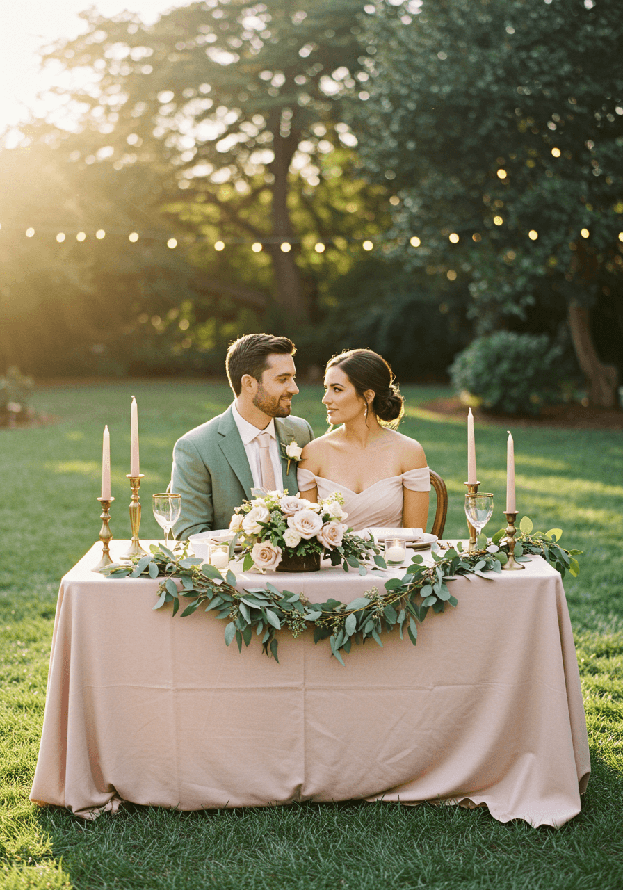
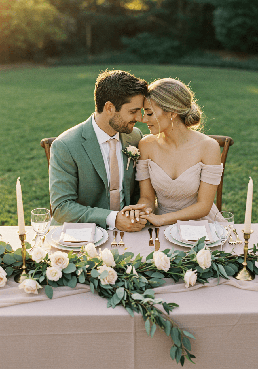
Romance in Golden Hour Light
There's something utterly magical about the way blush pink and sage green come together in natural light. This sweetheart table moment captures everything we adore about this palette—the soft femininity of blush linens against the organic richness of eucalyptus garlands. The golden hour backdrop transforms these gentle hues into something almost ethereal, whilst touches of warm metallics elevate the entire scene. For tips on capturing that light, see our lighting guide. This is for the couple who wants their wedding to feel like a dreamy garden party where every guest feels wrapped in warmth and beauty.
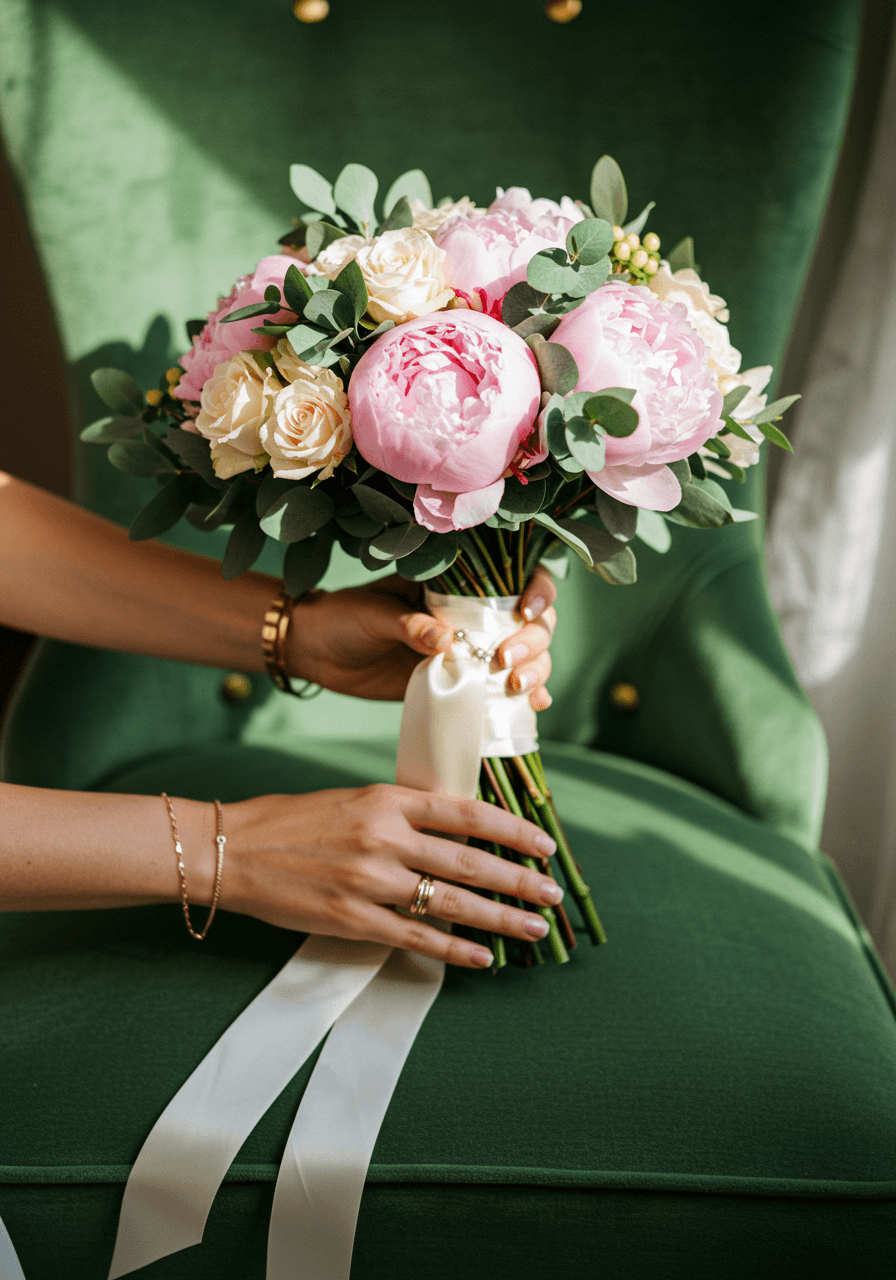
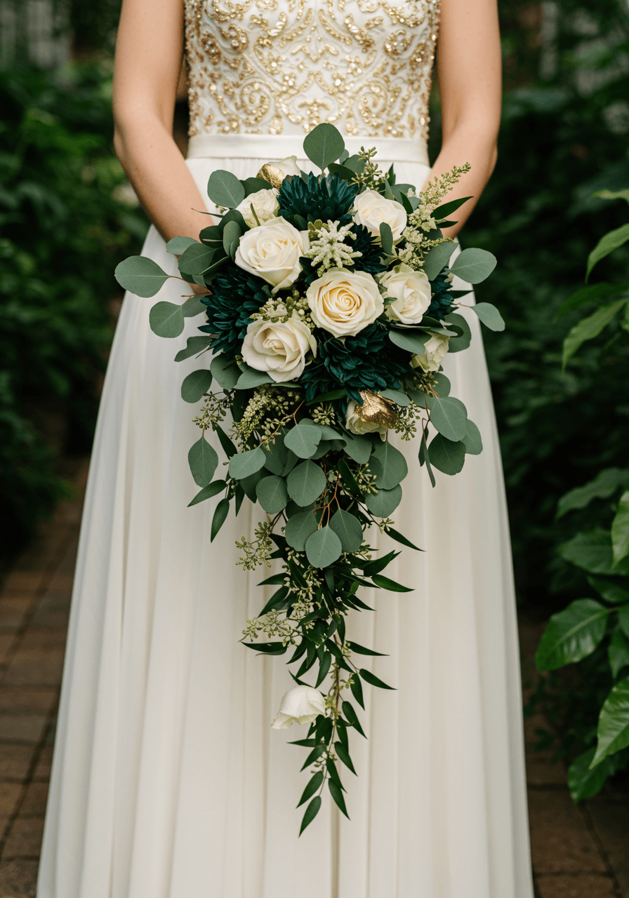
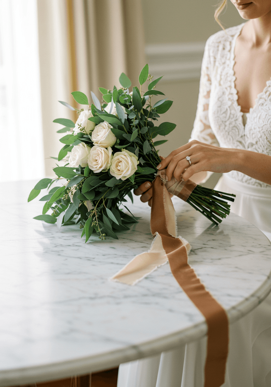
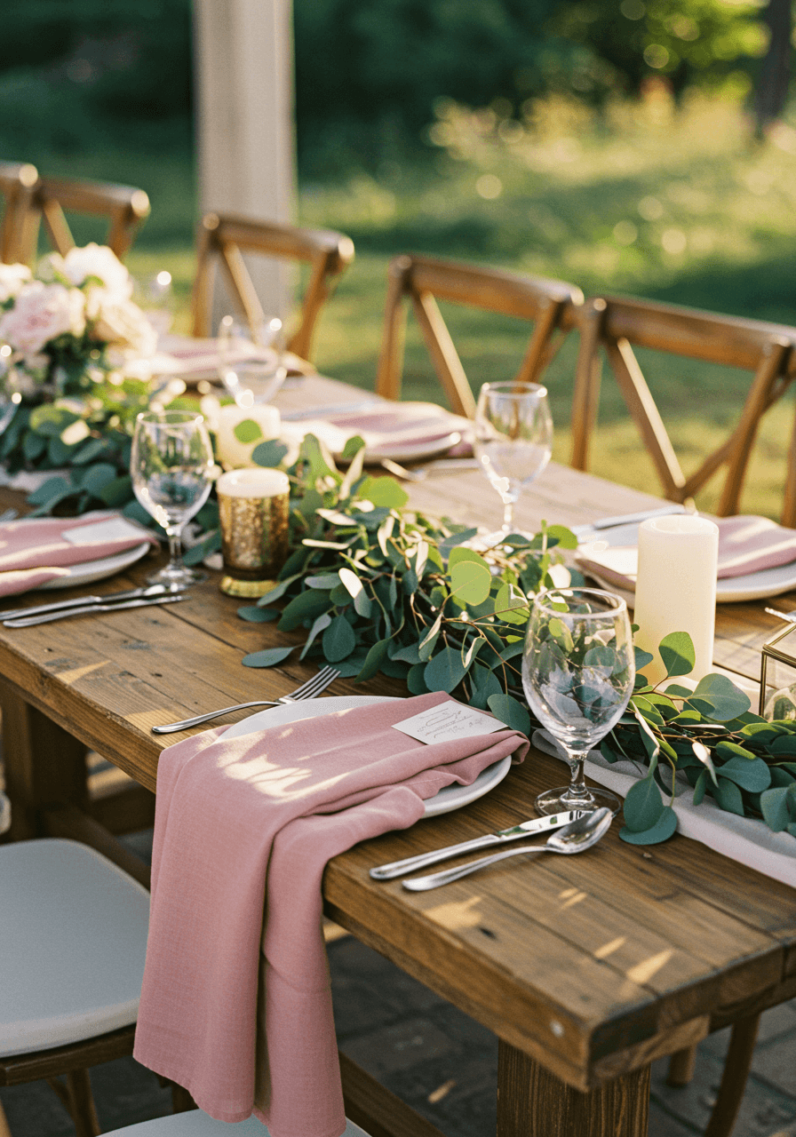
Luxurious Details in the Bridal Suite
We're obsessed with how this bouquet showcases the sophisticated side of blush and sage. The rich velvet textures and delicate gold jewellery create layers of luxury that speak to the discerning bride. Notice how the sage green provides the perfect neutral backdrop—it's earthy enough to feel grounded yet elegant enough for the most refined celebration. For style inspiration that complements this look, check our bridal dress ideas. The soft afternoon light streaming through reveals every petal and leaf in perfect detail, creating a moment that feels both intimate and utterly polished.
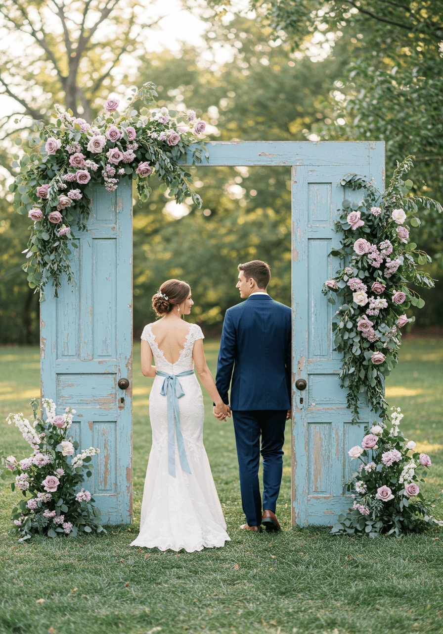
Dusty Blue and Mauve Wedding Colour Palettes
Vintage Romance Meets Modern Elegance
This is why we believe dusty blue and mauve create pure poetry together. The weathered door frame becomes a stunning architectural element, whilst the cascading florals in soft mauve tones add romance without overwhelming the scene. There's something so intentionally beautiful about this combination—dusty blue grounds the palette with its sophisticated depth, whilst mauve brings just enough warmth to keep everything feeling approachable and inviting. Perfect for the couple who loves vintage charm with a contemporary twist.
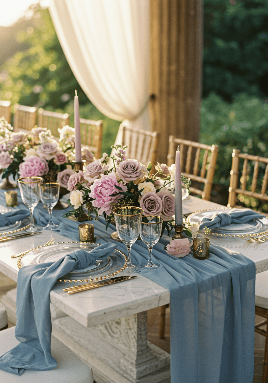
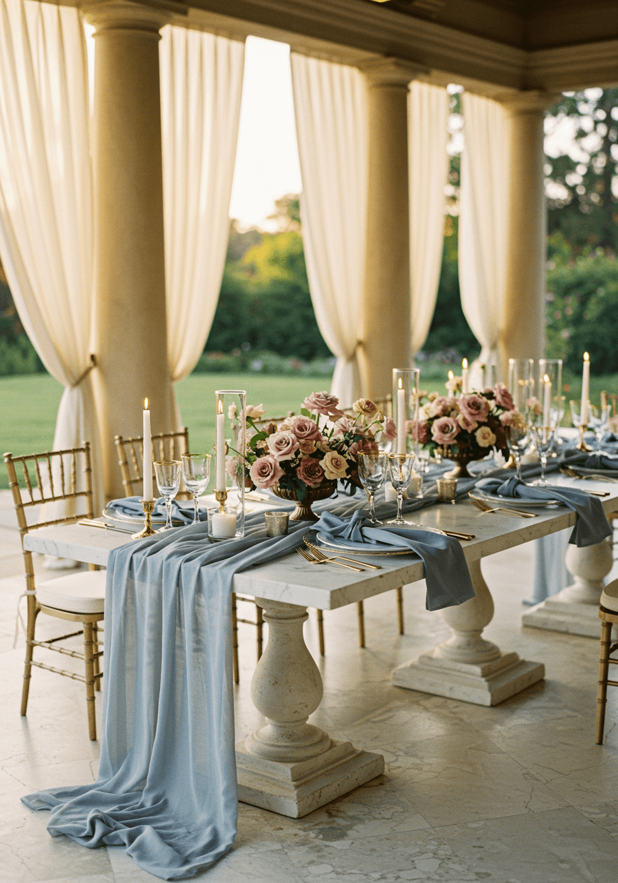
Marble Elegance with Garden Romance
Just imagine your guests' faces when they see this stunning tablescape. The marble surface provides the most luxurious foundation, whilst the dusty blue silk runner adds that perfect pop of colour that feels both bold and refined. We love how the mauve florals seem to dance across the table—there's movement and life here that keeps the formal elements from feeling too precious. For more ideas on elevated tabletops, explore our tablescape inspiration. This palette works beautifully for couples who want their reception to feel like an upscale garden party in the most elegant pavilion imaginable.
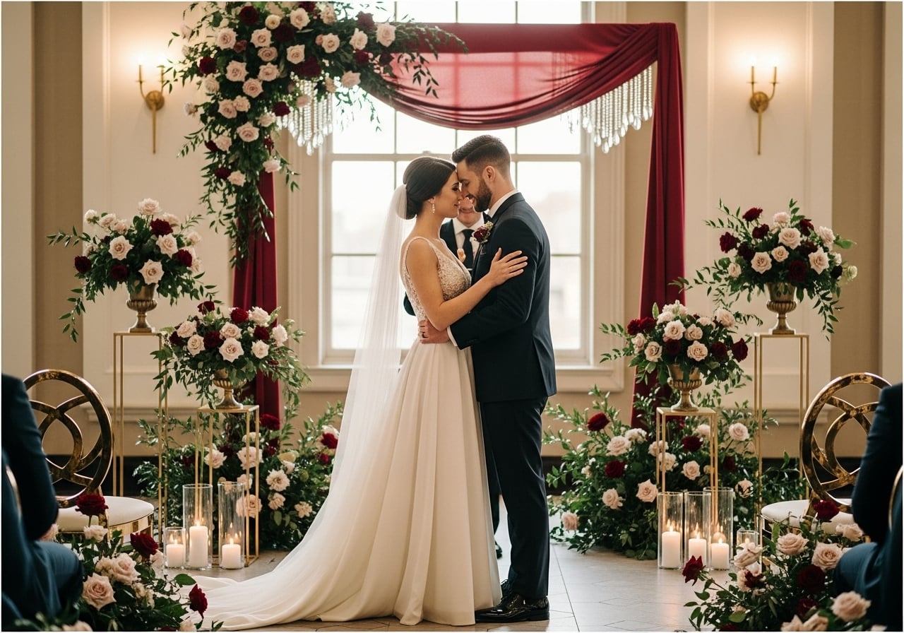
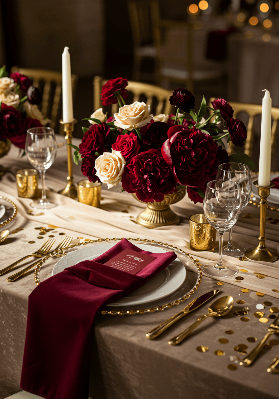
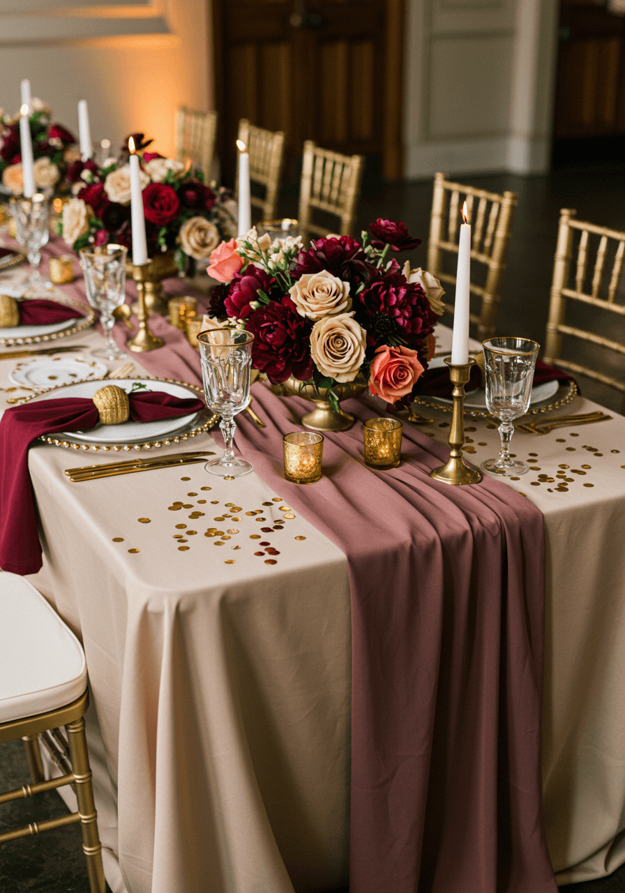
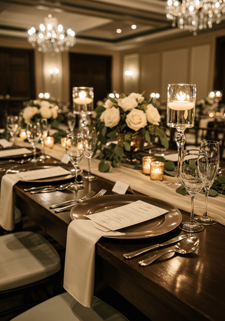
Champagne and Burgundy Wedding Colour Palettes
Opulent Sophistication in Every Detail
Champagne and burgundy together? Absolutely divine. This colour combination whispers luxury in the most beautiful way—the rich burgundy velvet napkins against champagne silk create texture contrasts that feel expensive and intentional. For tips on working with deep reds, read our burgundy decor guide. Notice how the gold accents tie everything together without competing for attention. The scattered gold confetti adds just enough sparkle to catch the light beautifully. This is for couples who aren't afraid to embrace drama and want their wedding to feel like the most elegant celebration their guests have ever attended.
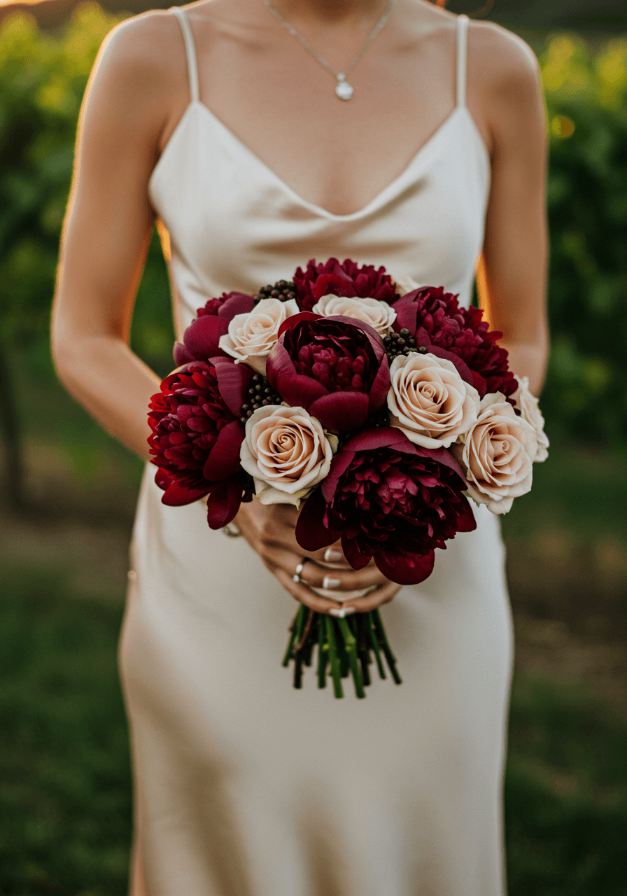
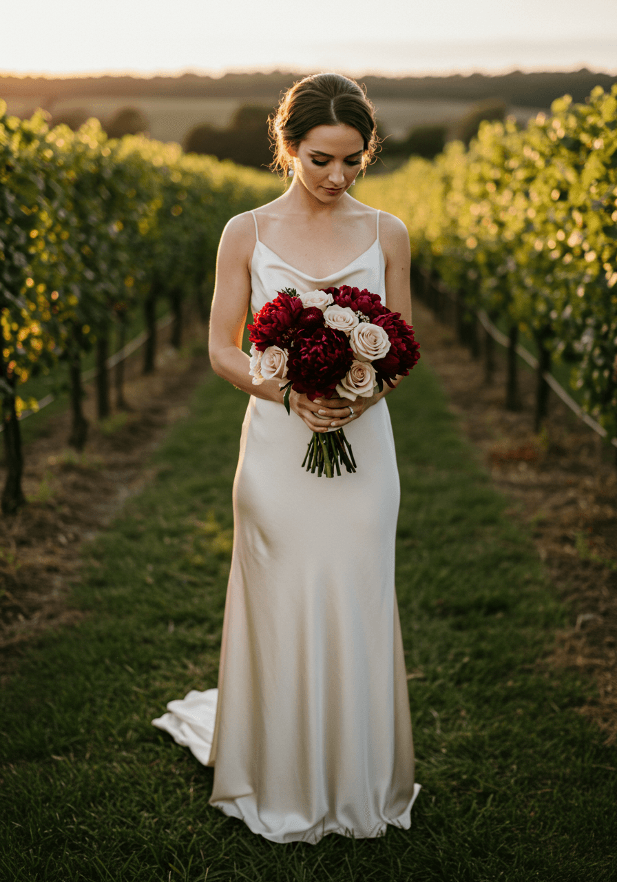
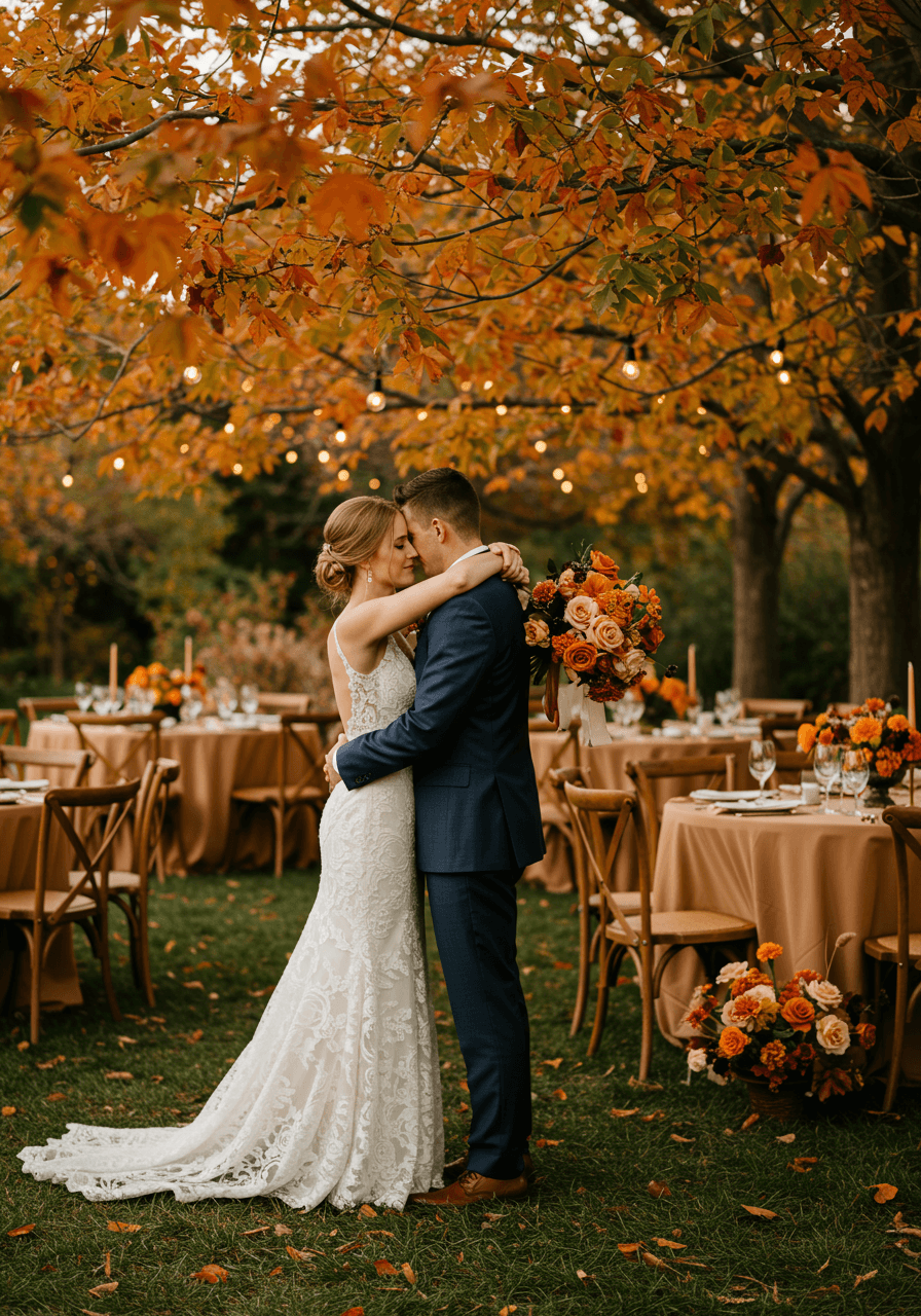
Vineyard Dreams in Rich Jewel Tones
There's something so romantically timeless about burgundy peonies paired with champagne roses—especially when captured in the golden light of a vineyard setting. The depth of colour in this bouquet feels almost regal, whilst the champagne blooms keep everything from feeling too heavy. For vineyard and villa ideas that match this mood, see our Tuscan villa inspiration. We love how the silk wedding dress catches the light, creating this gorgeous interplay between the rich florals and the flowing ivory fabric. This palette is perfect for autumn celebrations or any couple drawn to colours that feel both luxurious and deeply romantic.
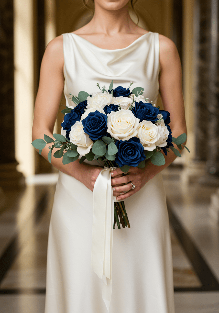
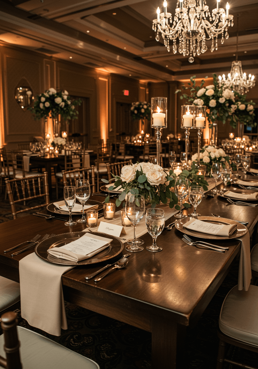
Ivory and Deep Navy Wedding Colour Palettes
Classic Elegance with Navy Sophistication
When we see ivory paired with deep navy, we think of timeless sophistication that never goes out of style. This bouquet moment captures everything beautiful about this classic combination—the rich navy roses provide such gorgeous depth against the crisp white peonies, whilst the marble setting adds architectural elegance. The pearl accents are that perfect finishing touch that elevates the entire arrangement; for jewellery inspiration, check our jewellery guide. This is for couples who appreciate traditional beauty but want their wedding to feel fresh and contemporary.
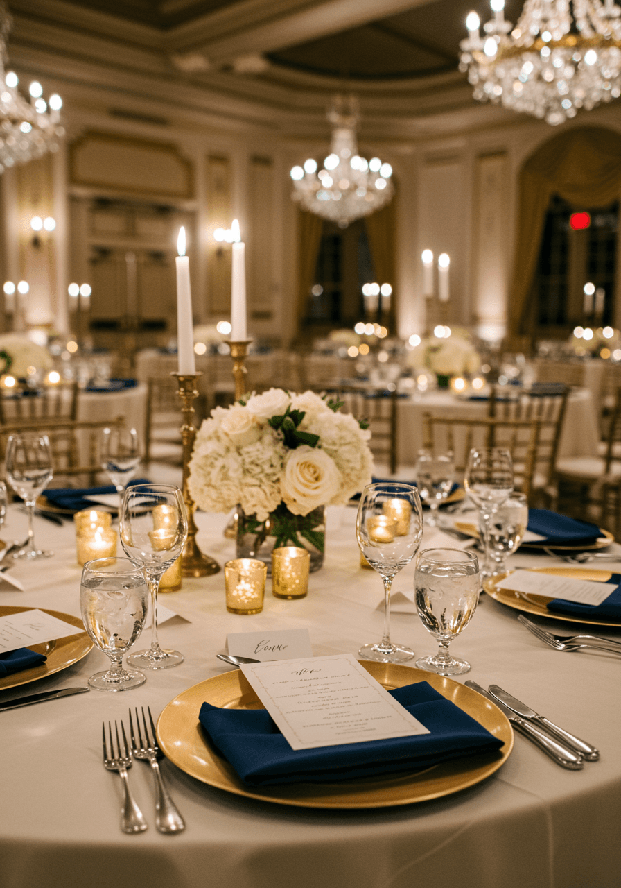
Ballroom Glamour with Navy and Gold
Crystal chandeliers, navy linens, and gold accents—could there be a more stunning combination for an elegant ballroom reception? We love how the navy napkins create such beautiful contrast against the ivory linens, whilst the gold charger plates catch and reflect the chandelier light magnificently. The white hydrangeas and ivory roses keep everything feeling fresh and romantic, preventing the formal elements from feeling too serious. This palette screams luxury in the most sophisticated way possible.
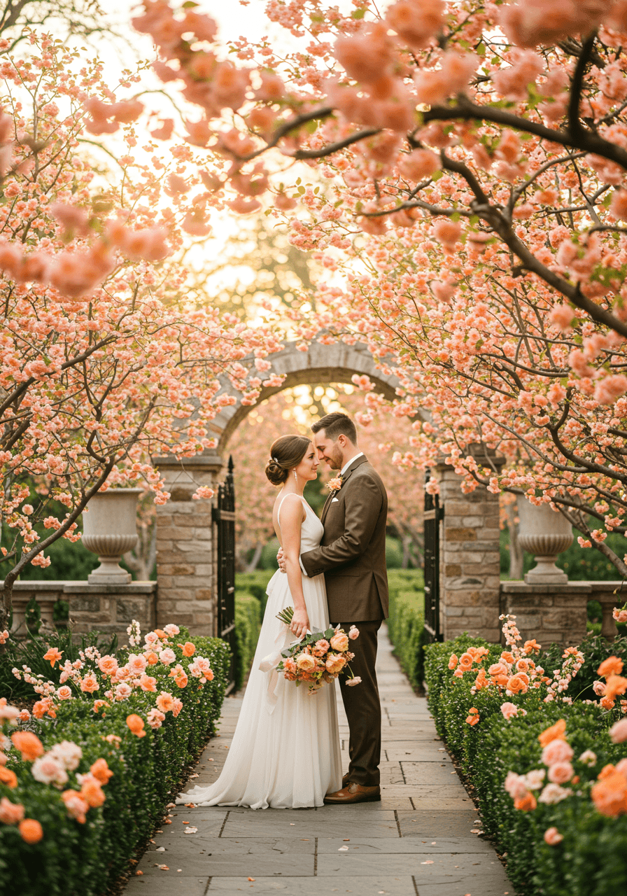
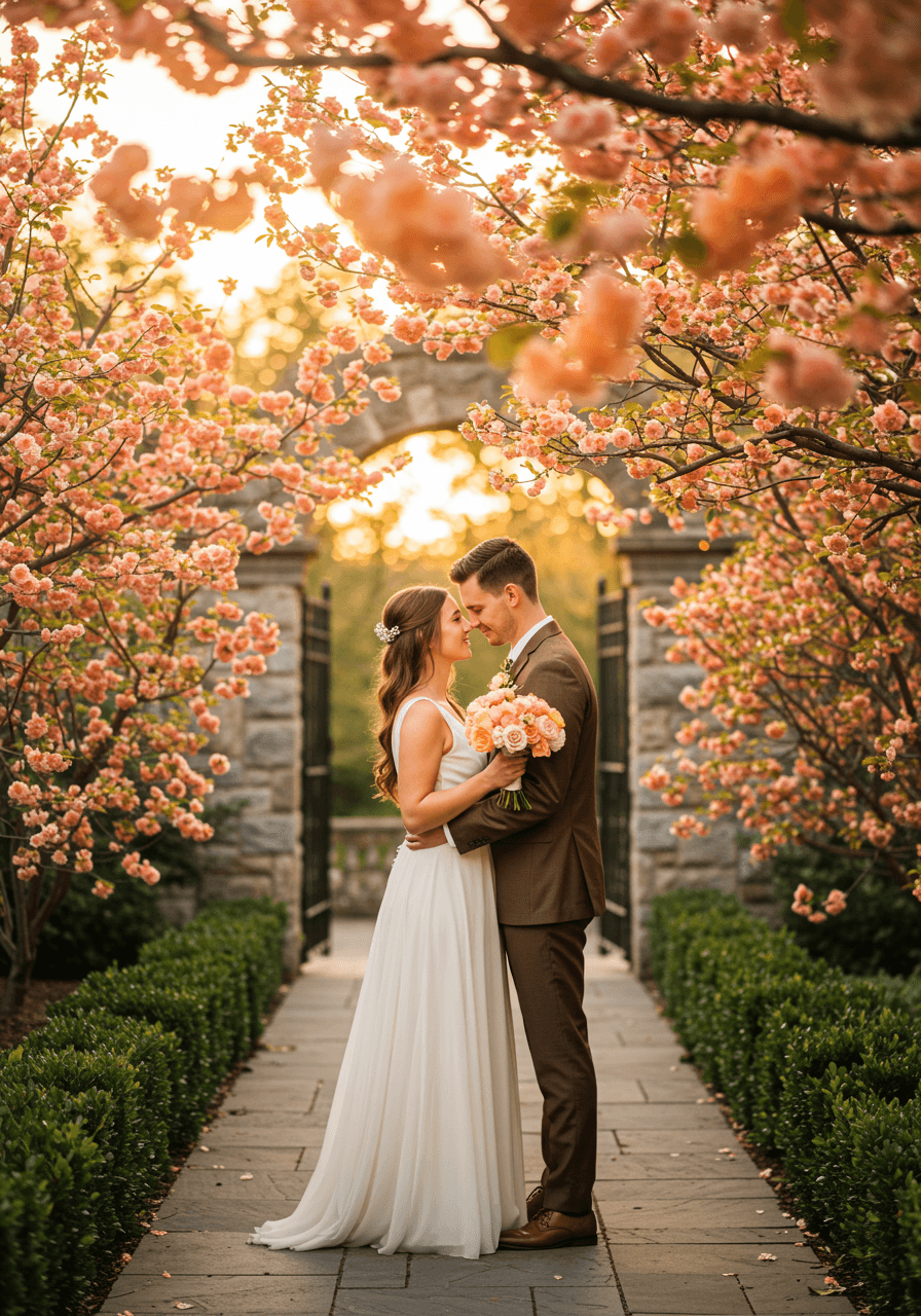
Terracotta and Cream Wedding Colour Palettes
Mediterranean Romance in Terracotta
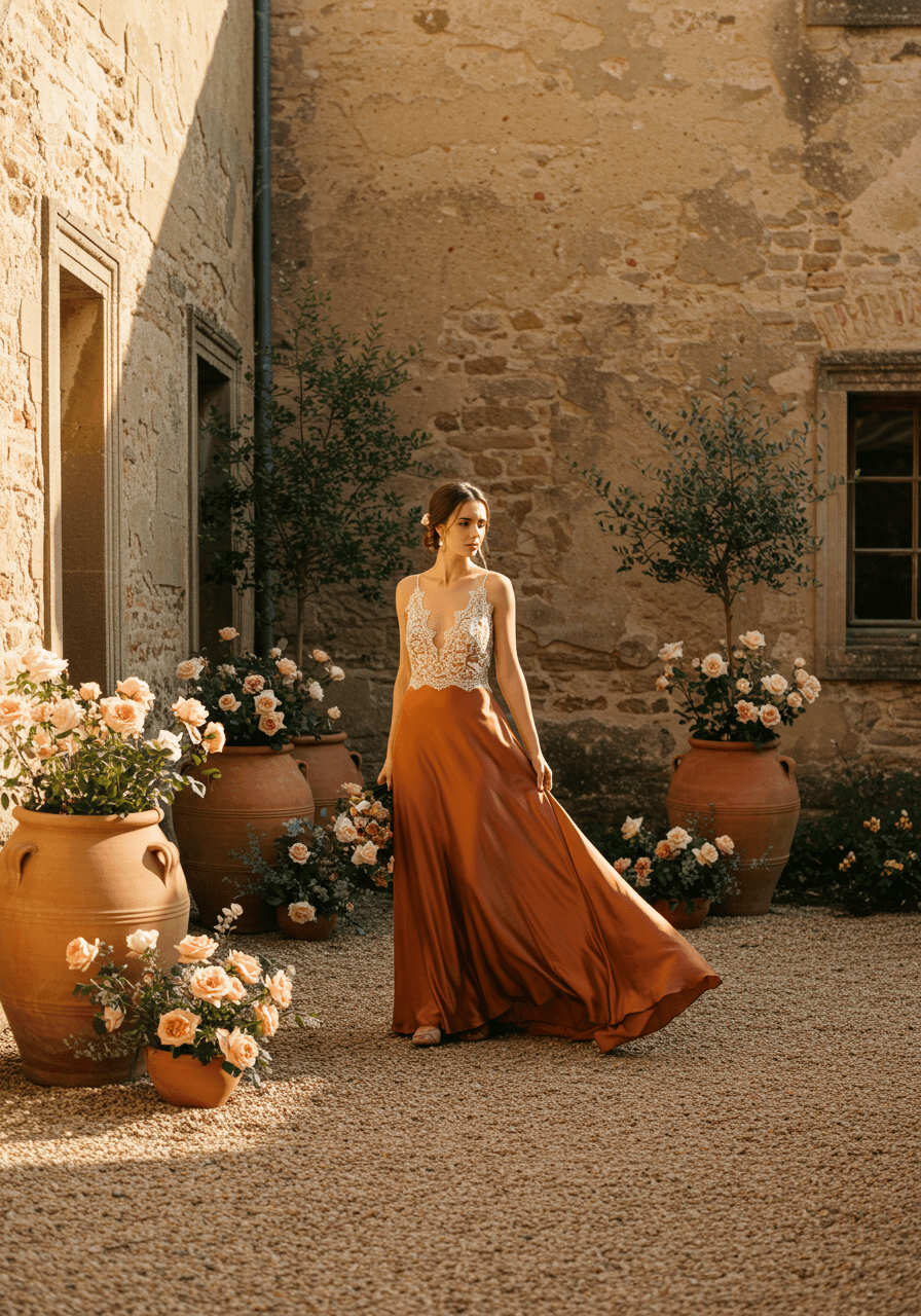
Terracotta might just be one of our favourite wedding colours—it's warm, sophisticated, and works beautifully in so many settings. This garden portrait showcases how terracotta silk creates such gorgeous movement and richness, especially when paired with the cream lace details. The weathered stone walls and pottery planters add authentic Mediterranean charm, whilst the cream roses provide the perfect soft contrast. If you're planning a villa celebration, our Tuscan villa ideas are a great fit. This palette feels both earthy and elegant, perfect for couples who want their wedding to feel warmly sophisticated.
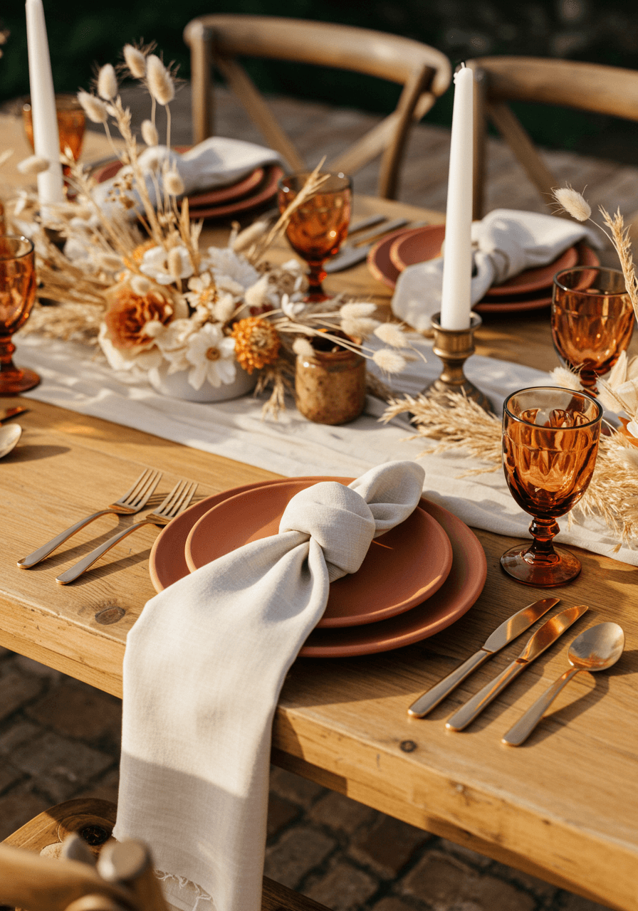
Mediterranean Villa Luxury
This tablescape perfectly captures the luxury of Mediterranean entertaining. The terracotta ceramic plates against cream silk napkins create such beautiful texture contrasts, whilst the dried pampas grass adds organic elegance that feels both modern and timeless—see ideas for dried arrangements in our dried flower guide. We love how the honey-coloured wood grain provides warmth that makes the entire setting feel inviting yet sophisticated. The matte gold cutlery is that perfect finishing touch that elevates everything without feeling too formal.
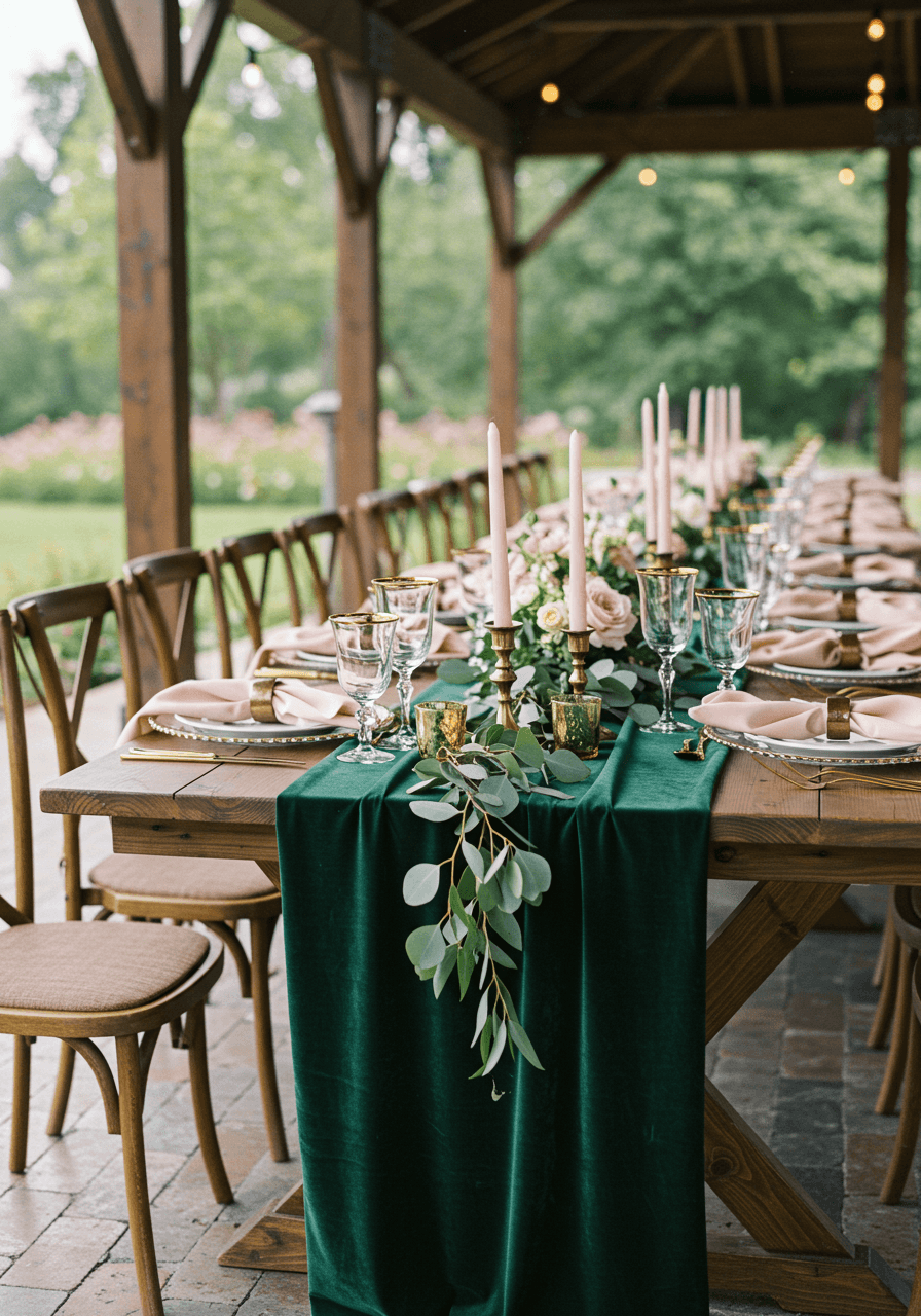
Emerald and Gold Wedding Colour Palettes
Jewel Tone Drama with Gold Glamour
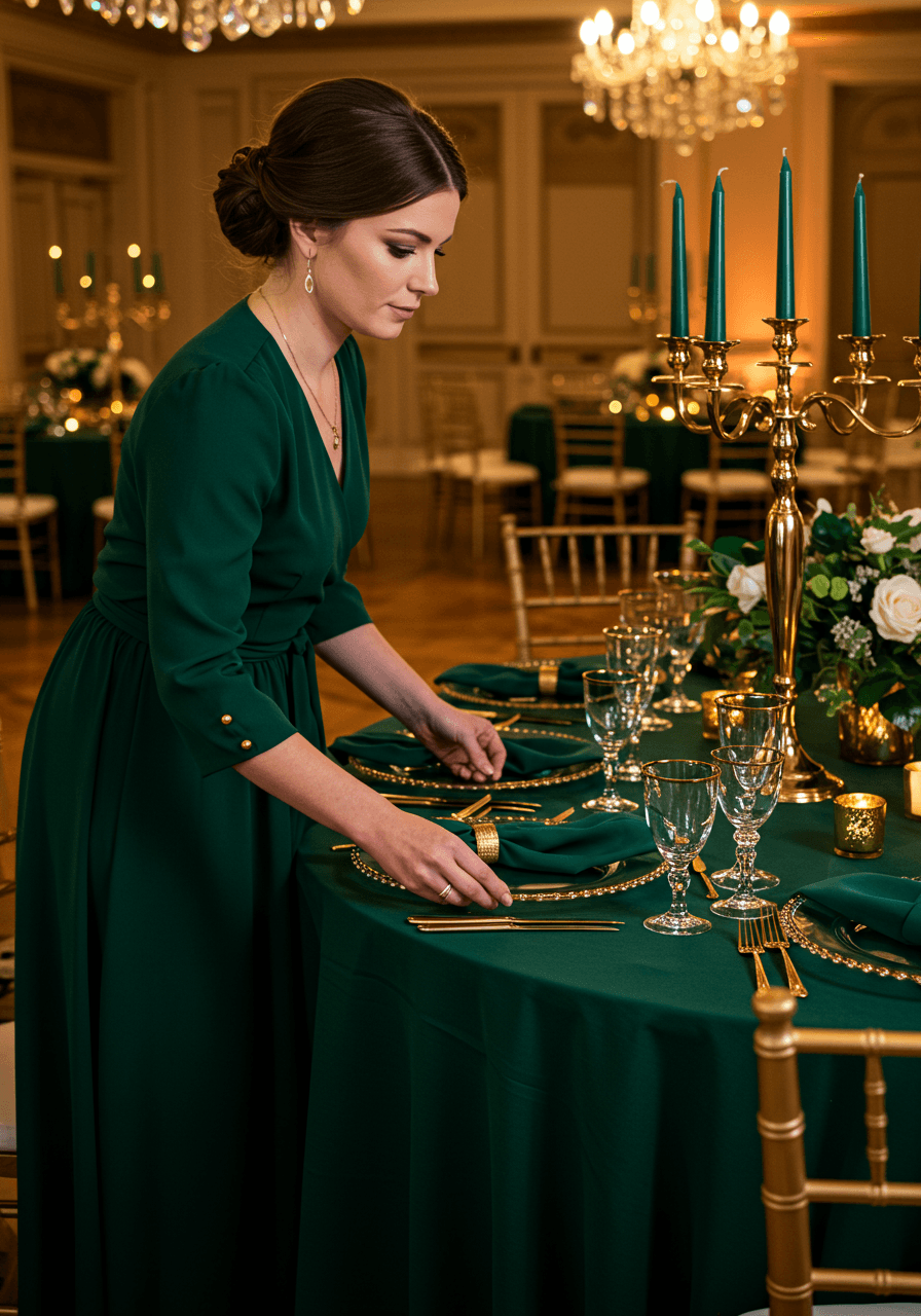
When emerald green meets gold, magic happens. This opulent tablescape proves that bold jewel tones can feel incredibly sophisticated when paired with the right metallics. For ways to incorporate rich greens in attire, browse our emerald inspiration. The emerald velvet linens create such rich depth, whilst the gold candelabras add theatrical glamour without overwhelming the natural beauty of the white florals. Crystal chandeliers catch and reflect both colours beautifully, creating an atmosphere that feels both dramatic and refined. This is for couples who want their wedding to feel like a celebration fit for royalty.
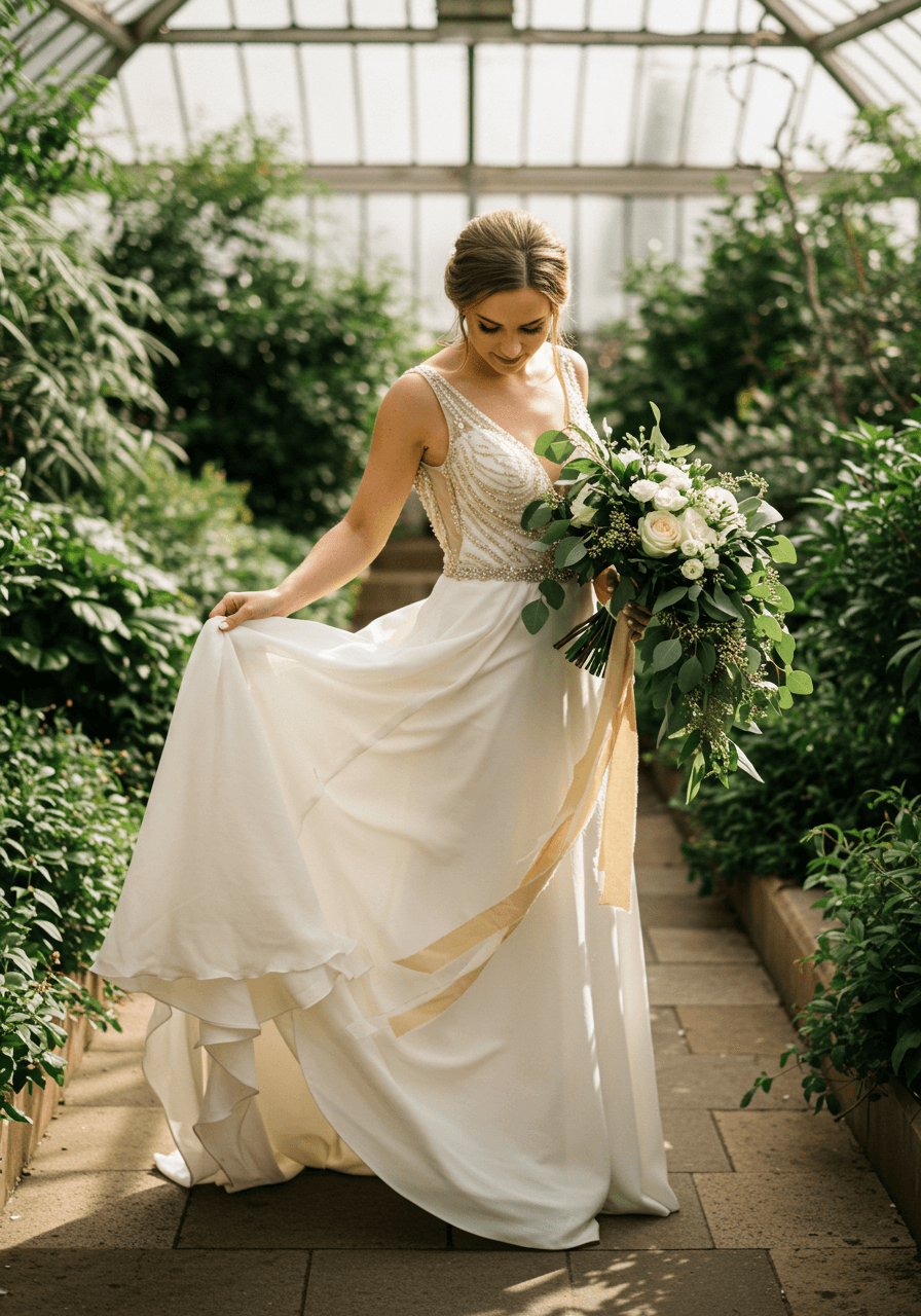
Conservatory Romance in Rich Green
This conservatory setting showcases emerald and gold in its most romantic light. The natural greenery provides the perfect backdrop for the emerald eucalyptus in the bouquet, whilst the gold beading on the ivory gown catches the filtered sunlight beautifully. For venue ideas with beautiful glass houses, see our orangery venues. The white roses keep the palette from feeling too heavy, adding brightness that makes everything feel fresh and modern. This combination works brilliantly for couples who love rich colours but want their wedding to feel naturally elegant rather than overly formal.
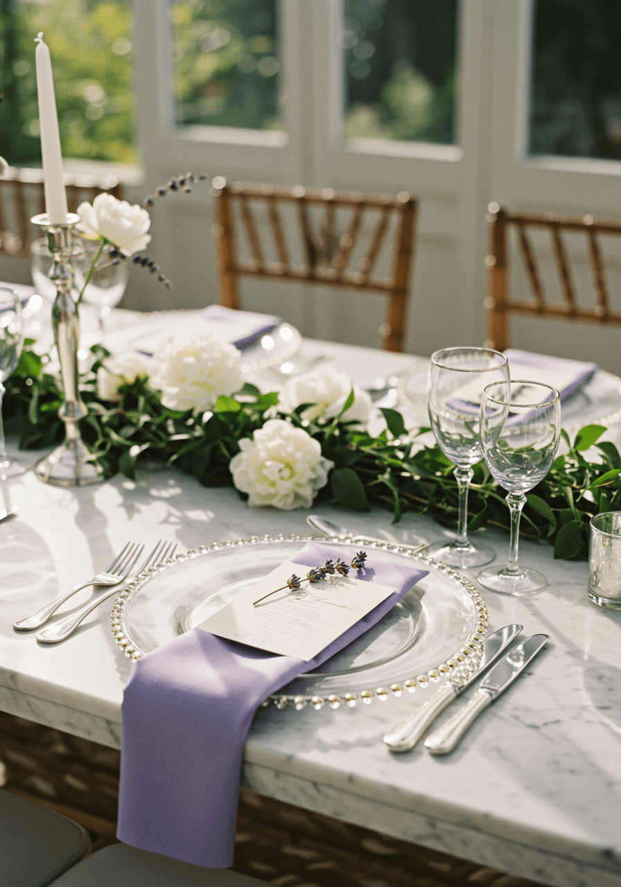
Lavender and Silver Wedding Colour Palettes
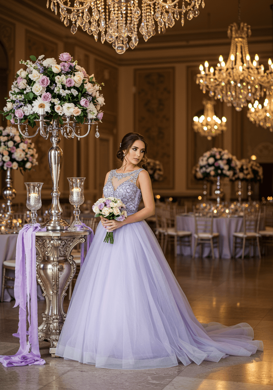
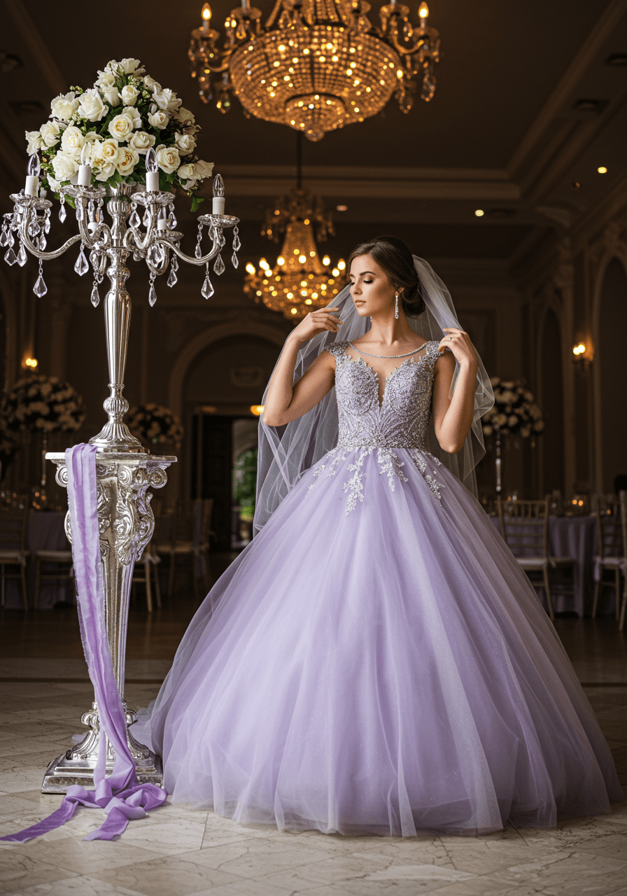
Ballroom Romance in Soft Purple
Lavender brings such unexpected sophistication when paired with silver metallics. This ballroom moment captures the dreamy romance of soft purple tulle against ornate silver candelabras, whilst crystal chandeliers add sparkle that makes everything feel magical. The silver beading on the gown creates movement and texture that photographs beautifully in both natural and artificial light. This palette is perfect for couples who want something feminine and romantic but with enough elegance to work in formal venues.
Garden Party Sophistication
This conservatory tablescape proves that lavender can work beautifully in both formal and relaxed settings. The soft purple tones create a romantic backdrop for white peonies, whilst silver accents add just enough glamour to elevate the entire design. If you love outdoor reception ideas, our garden reception guide has great tips. We love how the trailing greenery softens the formal elements, creating a look that feels both sophisticated and naturally beautiful. This is ideal for couples planning garden parties or outdoor celebrations who still want an elevated, luxurious feel.
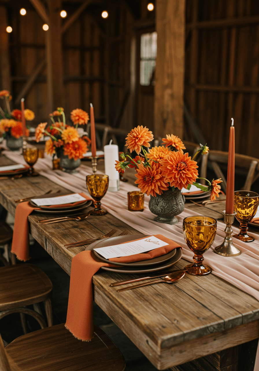
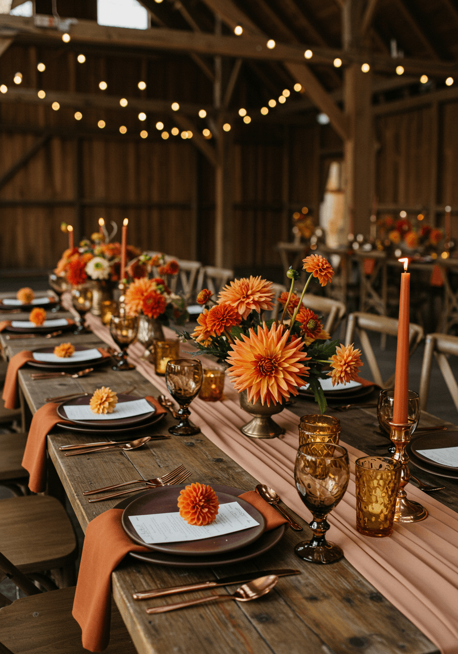
Rust and Taupe Wedding Colour Palettes
Autumn Garden Romance
Rust and taupe create such gorgeous warmth together, especially in natural garden settings. This golden hour embrace showcases how these earthy tones work beautifully for autumn celebrations—the rust bridesmaid dresses add rich colour without overwhelming the scene, whilst taupe linens provide sophisticated neutrals that ground everything. The natural light brings out the depth in both colours, creating an atmosphere that feels both rustic and refined.
Rustic Elegance with Luxury Details
This barn setting proves that rustic venues can feel incredibly luxurious with the right colour choices. The taupe runners create elegant foundations for rust napkins, whilst copper flatware adds warm metallic touches that feel both rustic and refined. For barn decor ideas, see our barn decor guide. String lights create romantic ambiance that brings out the richness in both colours. This palette is perfect for couples who want their celebration to feel relaxed and comfortable whilst maintaining sophisticated style.
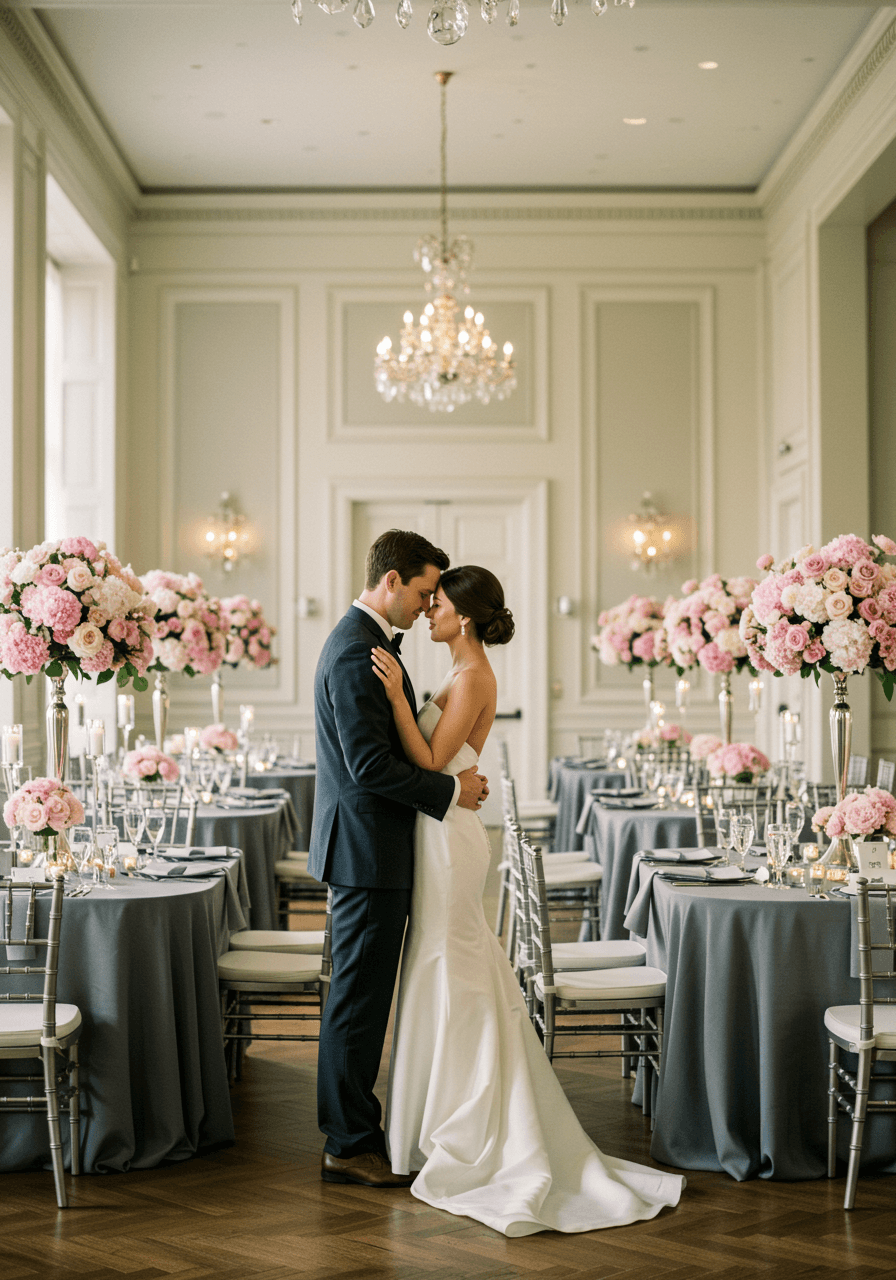
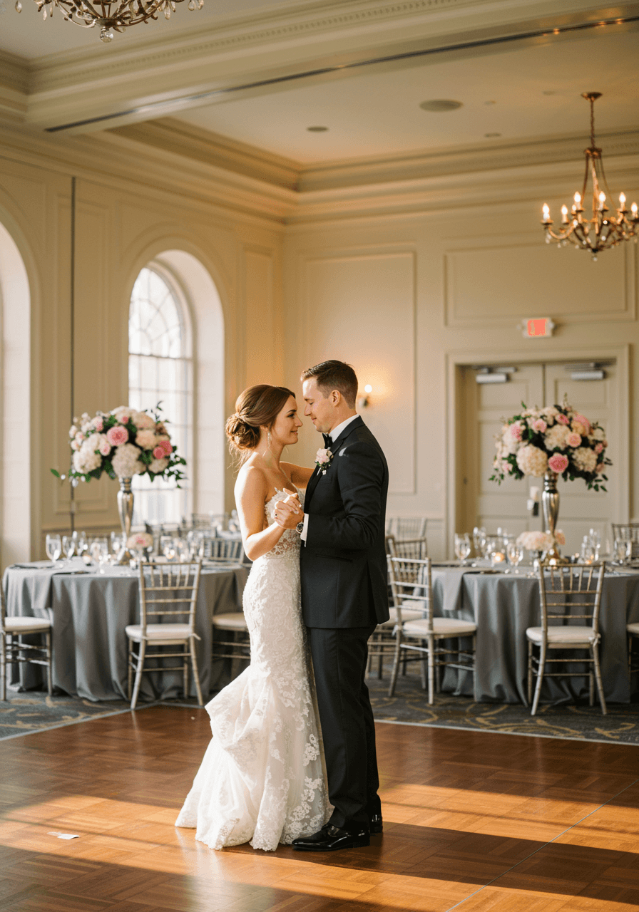
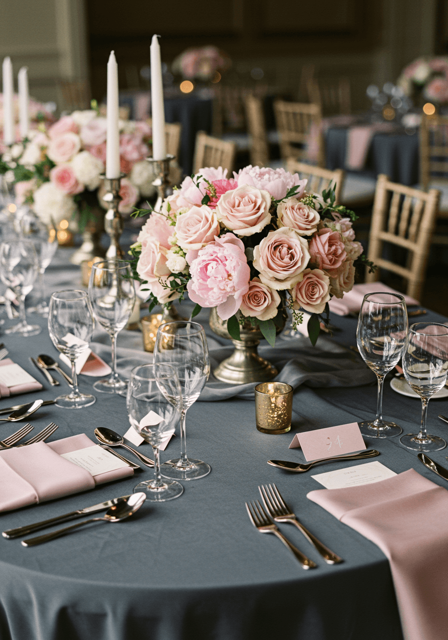
Soft Pink and Charcoal Wedding Colour Palettes
Modern Romance with Classic Contrast
Soft pink and charcoal create such beautiful balance—the feminine romance of pink against the sophisticated masculinity of charcoal grey. This ballroom moment captures how these colours work together to create something both romantic and contemporary. The golden hour lighting brings out the warmth in the pink whilst making the charcoal feel rich rather than stark. This palette appeals to couples who want traditional romance with modern sophistication.
Contemporary Luxury in Pink and Grey
This tablescape showcases the sophisticated side of pink and charcoal beautifully. The soft pink roses feel fresh and romantic against charcoal runners, whilst rose gold flatware bridges both colours perfectly. For modern decor direction that matches this aesthetic, explore our modern decor ideas. The contrast creates visual interest without feeling too bold or overwhelming. This combination works brilliantly for couples who want their wedding to feel both feminine and strong, romantic yet contemporary.
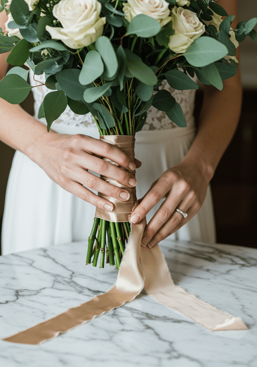
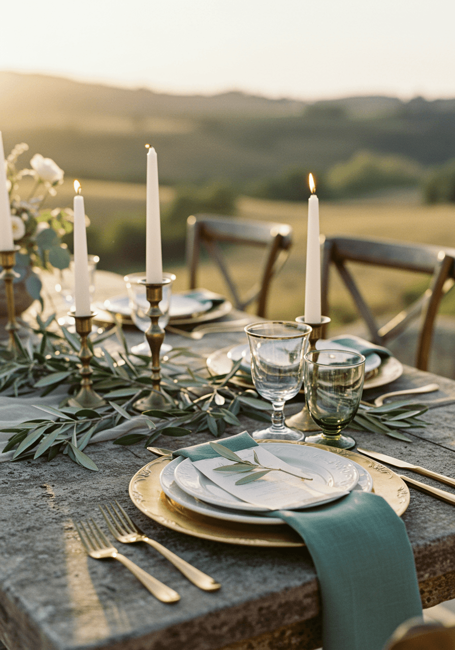
Sage and Antique Brass Wedding Colour Palettes
Botanical Elegance with Vintage Metallics
Sage green paired with antique brass creates such understated luxury. This bouquet moment shows how these muted tones work together beautifully—the sage eucalyptus provides organic texture whilst cream roses add softness, and the antique brass ribbon brings vintage glamour without being too shiny or new. For decor that emphasizes those vintage metallics, see our wedding decor guide. The marble backdrop adds classical elegance that makes everything feel timeless and refined. This palette is perfect for couples who appreciate subtle sophistication.
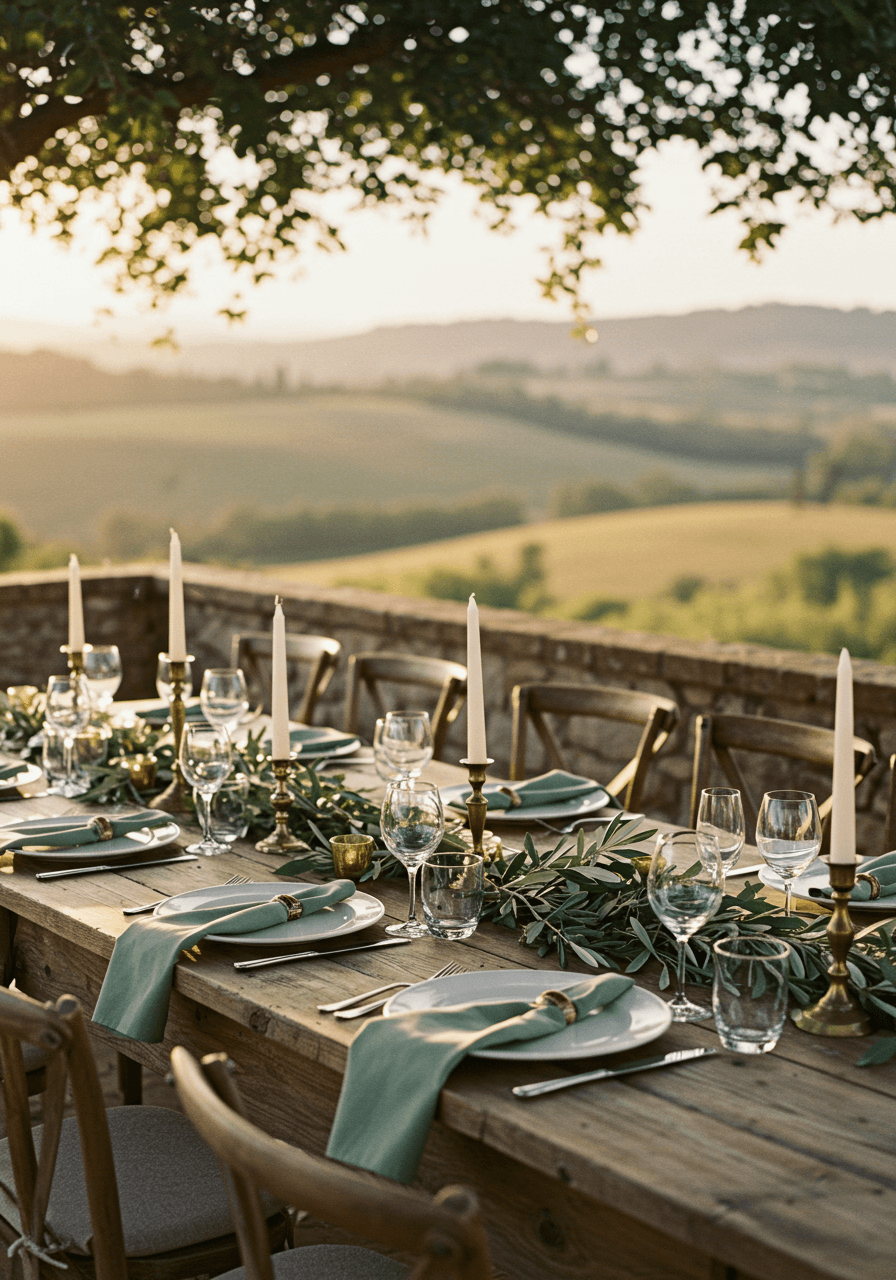
Terrace Dining with Vintage Glamour
This stone terrace setting showcases sage and antique brass in its most romantic light. The sage napkins provide organic colour that feels naturally beautiful, whilst brass charger plates add warm metallic touches that catch the golden hour light perfectly. For outdoor venue ideas with beautiful terraces, check our outdoor venue guide. The stone setting grounds everything with natural elegance, creating an atmosphere that feels both rustic and refined. This palette works brilliantly for outdoor celebrations or venues with natural architectural elements.
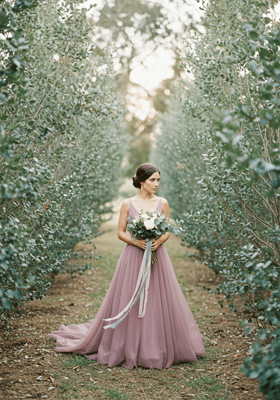
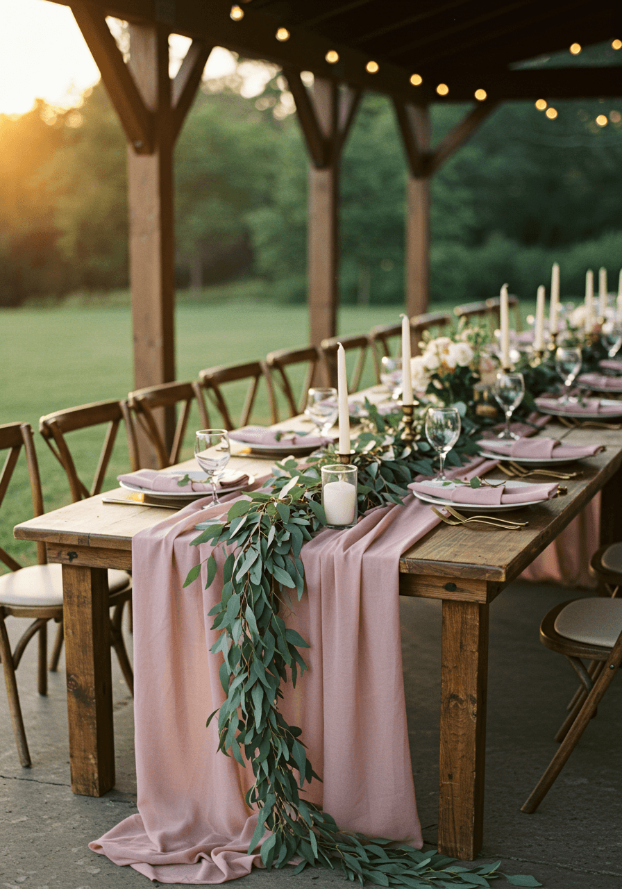
Dusty Rose and Eucalyptus Wedding Colour Palettes
Garden Romance in Muted Tones
Dusty rose and eucalyptus create such beautiful harmony together—the muted pink feels soft and romantic whilst the grey-green eucalyptus adds organic sophistication. This garden portrait captures how these colours work naturally together, with the silk gown creating movement against the eucalyptus backdrop. For decorating with dusty rose tones, see our dusty rose guide. The ribbon details tie everything together beautifully, creating a cohesive look that feels both feminine and grounded. This palette is perfect for couples who love botanical elements but want sophisticated colour choices.
Rustic Garden Party Elegance
This pavilion tablescape shows how dusty rose and eucalyptus work beautifully in more rustic settings. The wooden table provides natural warmth that makes the dusty rose linens feel grounded rather than precious, whilst eucalyptus garlands add organic elegance that bridges rustic and refined. For seasonal flower tips that pair well with eucalyptus, visit our seasonal flower guide. The combination creates an atmosphere that feels relaxed yet sophisticated, perfect for couples who want their wedding to feel naturally beautiful rather than overly formal.
Discover Wedding Inspiration
Browse our curated collection of stunning wedding photos, decor ideas, and venue inspiration. Find the perfect elements to make your special day unforgettable.
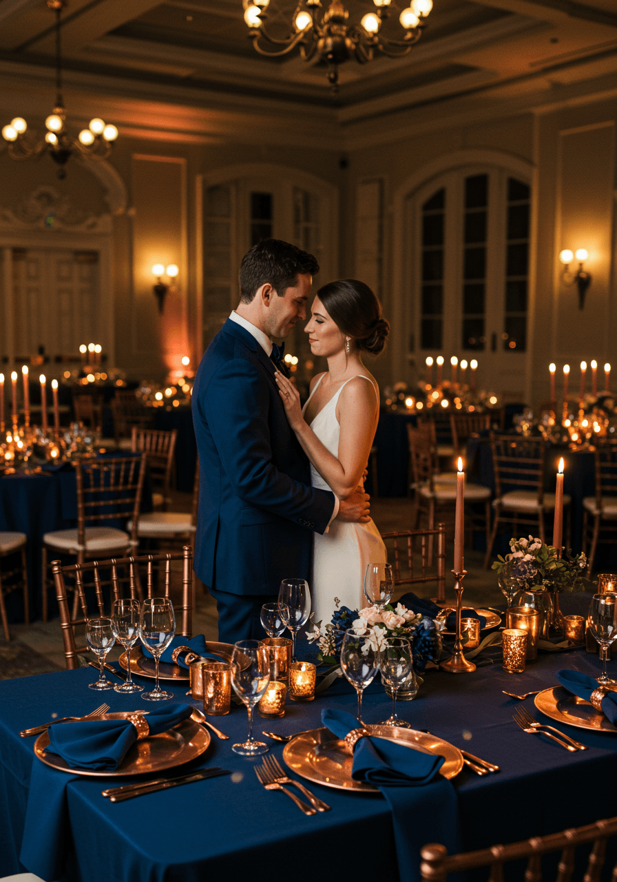
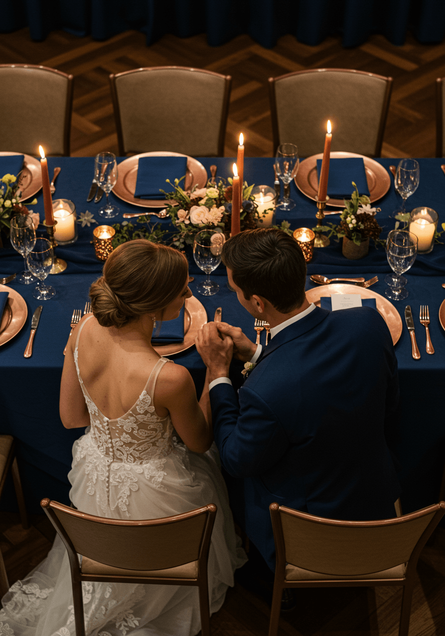
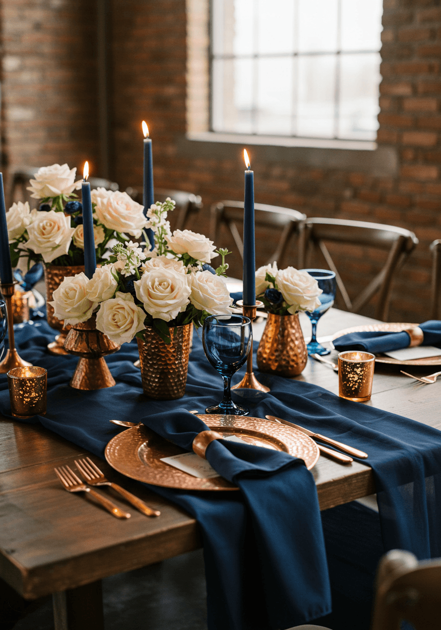
Explore GalleryMidnight Blue and Copper Wedding Colour Palettes
Dramatic Elegance with Warm Metallics
Midnight blue creates such dramatic sophistication, especially when warmed with copper metallics. This reception moment showcases how these colours work together to create atmosphere that feels both intimate and grand. The deep blue provides a rich backdrop that makes copper accents feel more precious, whilst candlelight brings out the warmth in both colours. If you're drawn to industrial or moody settings, see ideas in our edgy venue guide. This palette is perfect for couples who want their wedding to feel dramatic and luxurious whilst maintaining romantic intimacy.
Industrial Romance with Rich Metals
This industrial venue proves that midnight blue and copper can work beautifully in unexpected settings. The exposed brick walls provide texture that makes the rich blue linens feel more grounded, whilst hammered copper plates add artisanal elegance that bridges industrial and luxurious. This combination creates atmosphere that feels both edgy and refined, perfect for couples who want their wedding to feel contemporary and sophisticated rather than traditionally romantic.
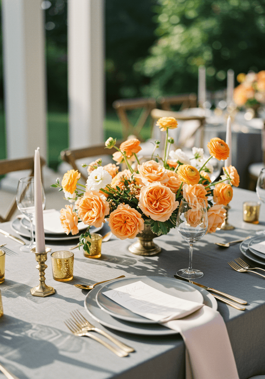
Warm Gray and Peach Wedding Colour Palettes
Spring Romance in Soft Neutrals
Warm grey and peach create such gentle sophistication together—the grey provides elegant neutrals whilst peach adds just enough colour to feel fresh and romantic. This garden embrace captures how these colours work beautifully in natural settings, with the stone archway providing architectural elegance that grounds the soft peach florals. For choosing colours by season, read our seasonal palette guide. The golden hour light brings out the warmth in both colours, creating atmosphere that feels both relaxed and refined.
Pavilion Luxury in Soft Tones
This pavilion setting showcases warm grey and peach at their most elegant. The grey linens create sophisticated foundations for peach floral centrepieces, whilst the outdoor setting keeps everything feeling fresh and natural. This palette works brilliantly for spring and summer celebrations, creating atmosphere that feels both sophisticated and approachable. Perfect for couples who want elegance without formality, luxury without pretension.
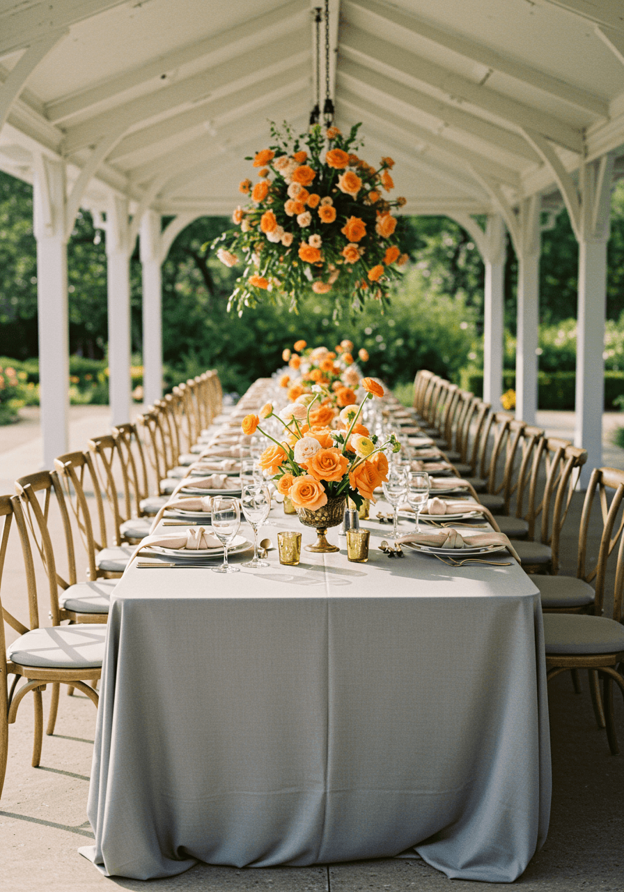
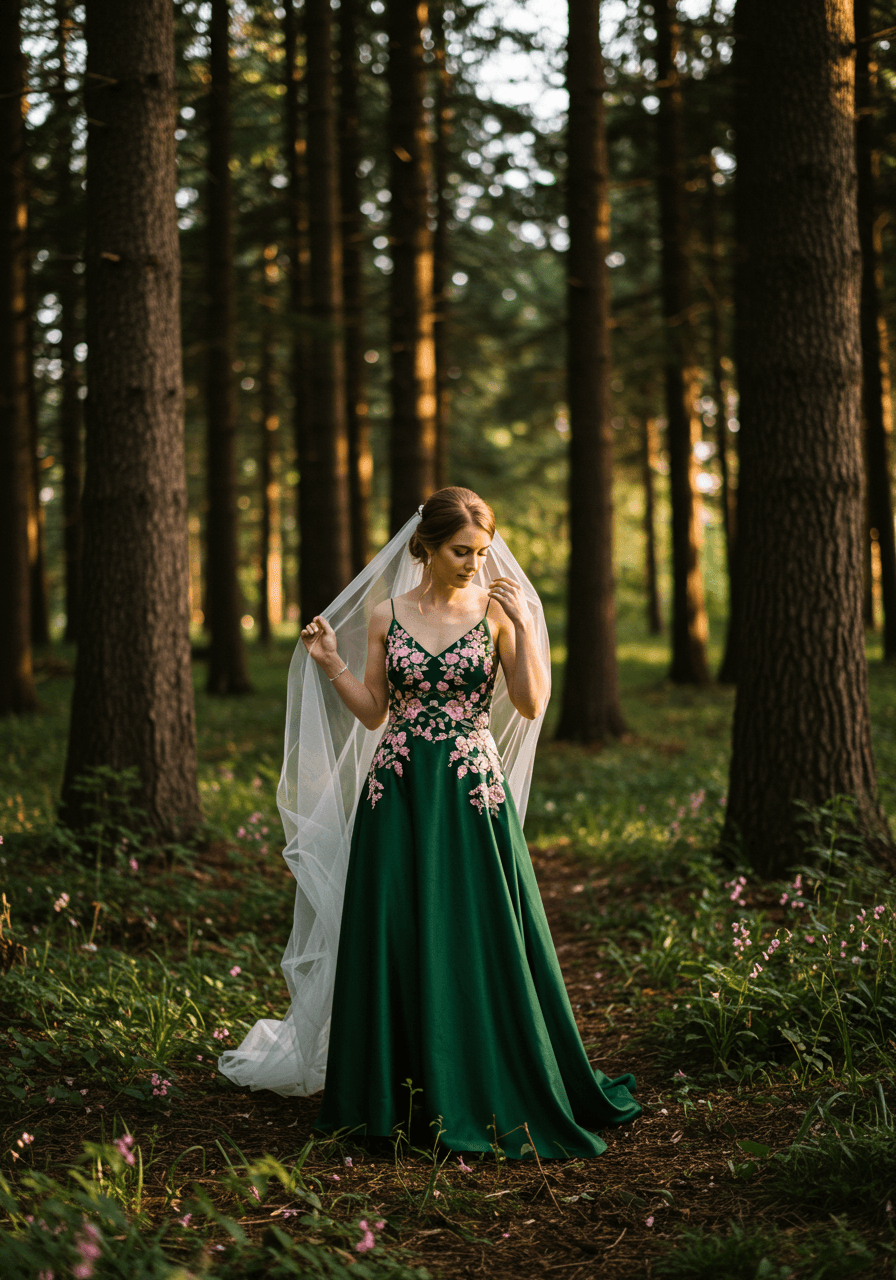
Forest Green and Blush Wedding Colour Palettes
Woodland Romance with Natural Drama
Forest green creates such unexpected drama for bridal fashion, especially when softened with blush details. This woodland portrait showcases how these colours work together beautifully—the deep green feels rich and sophisticated whilst blush embroidery adds feminine romance that keeps everything from feeling too bold. For enchanted woodland ceremony ideas, browse our enchanted forest guide. The natural forest setting provides the perfect backdrop, creating atmosphere that feels both dramatic and naturally beautiful. This palette is perfect for couples who want something unique yet timelessly elegant.
Garden Pavilion Elegance
This pavilion tablescape demonstrates how forest green and blush create sophisticated elegance together. The rich green velvet provides luxury texture whilst blush silk adds softness that makes everything feel romantic rather than too serious. The garden setting bridges both colours naturally, creating atmosphere that feels both dramatic and inviting. This combination works beautifully for couples who want their wedding to feel rich and luxurious whilst maintaining romantic charm.
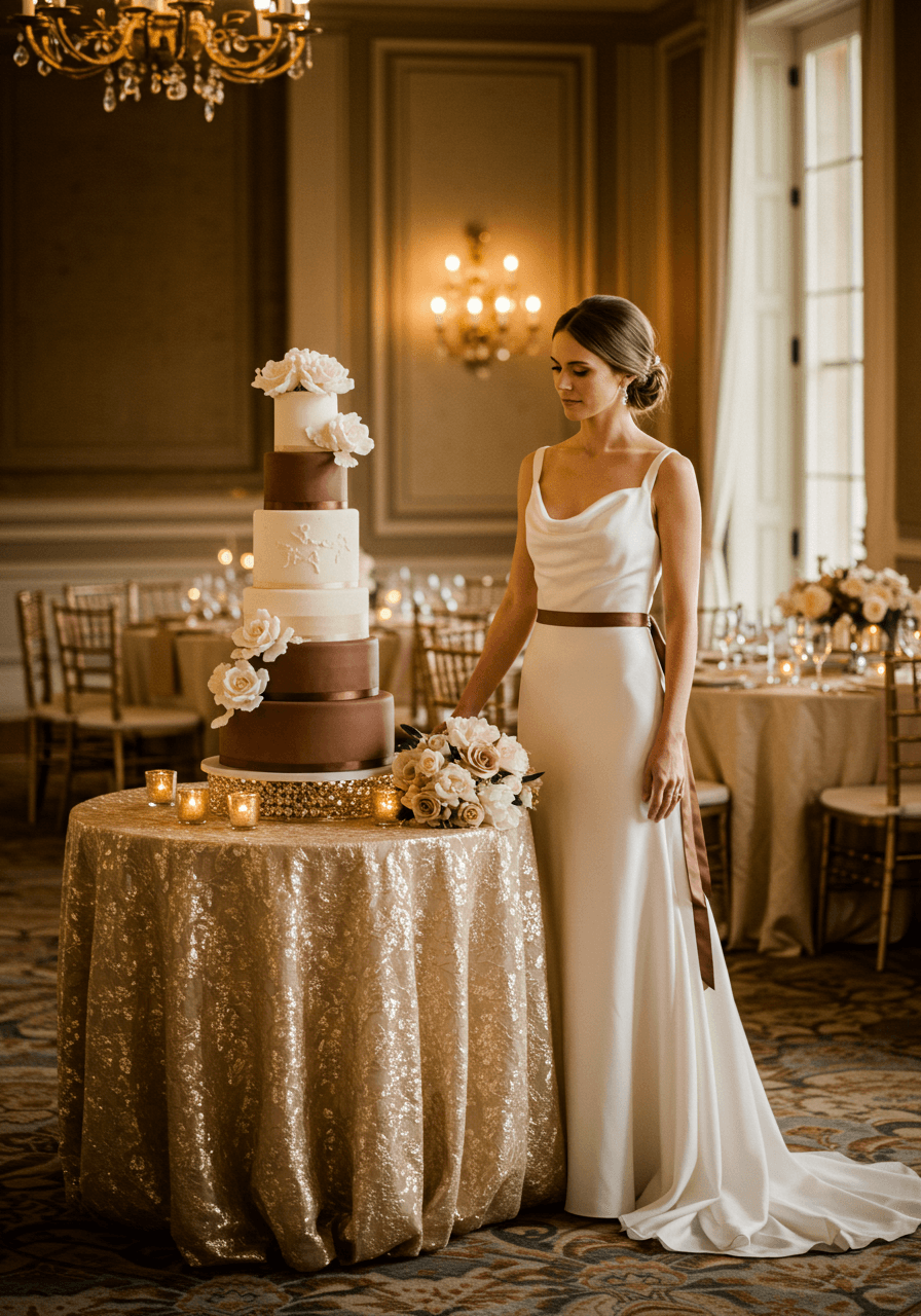
Mocha and Ivory Wedding Colour Palettes
Rich Neutrals with Classic Elegance
Mocha and ivory create such rich sophistication together—the warm brown provides depth whilst ivory adds brightness that keeps everything feeling fresh and elegant. This cake moment showcases how these colours work beautifully for formal celebrations, with the fondant creating smooth luxury whilst sugar flowers add delicate romance. For creative cake inspiration, read The Cake as Canvas. This palette appeals to couples who appreciate understated elegance and want their wedding to feel timelessly sophisticated rather than trendy.
Ballroom Luxury in Rich Browns
This ballroom setting proves that mocha and ivory can create incredible luxury in formal venues. The rich brown linens provide sophisticated depth whilst ivory accents add brightness that prevents everything from feeling too heavy. Crystal chandeliers reflect both colours beautifully, creating atmosphere that feels opulent yet refined. This palette is perfect for couples planning formal celebrations who want sophisticated colour choices that feel both rich and timeless.
The beauty of these wedding colour palettes lies in their ability to create luxury through thoughtful colour relationships rather than expensive materials alone. Each combination we've shared proves that the 'expensive' look comes from understanding how colours work together—the way sage green grounds romantic blush, how midnight blue makes copper accents feel more precious, or how warm grey elevates simple peach into something truly sophisticated. As you plan your celebration, remember that the most stunning weddings aren't necessarily the most expensive ones—they're the ones where every colour choice feels intentional, harmonious, and true to your personal style. Choose the palette that makes your heart sing, and trust that when colours are perfectly balanced, the luxury factor takes care of itself.